Chloe AI
- Brand strategy
- Logotype
- Visual identity system
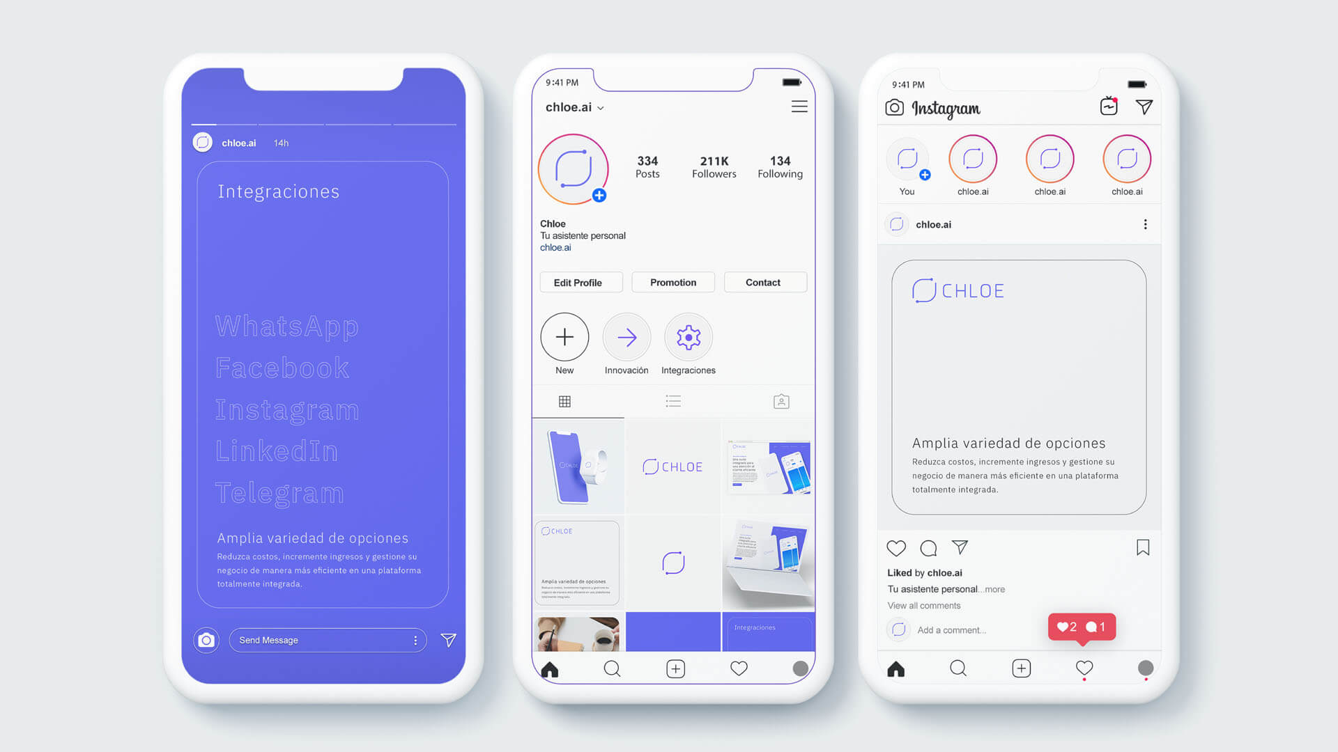
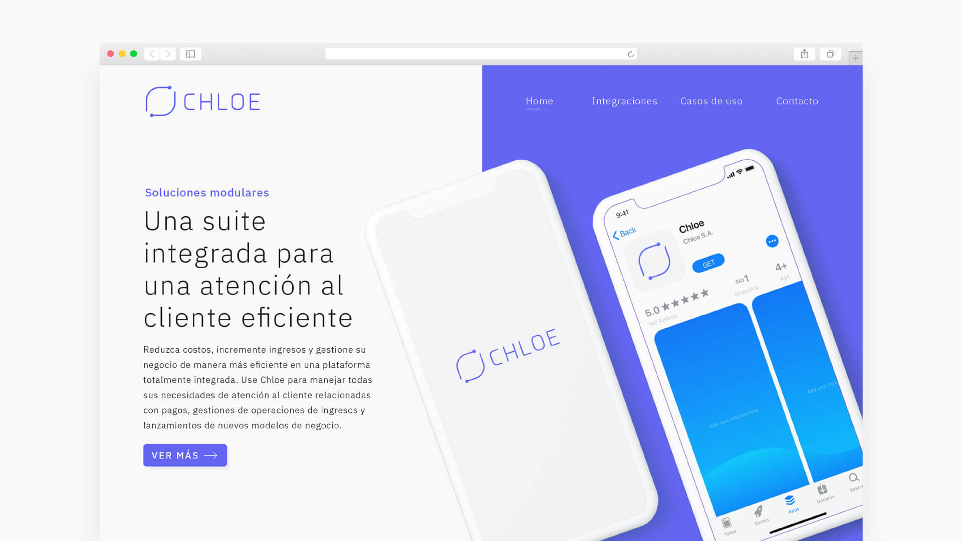
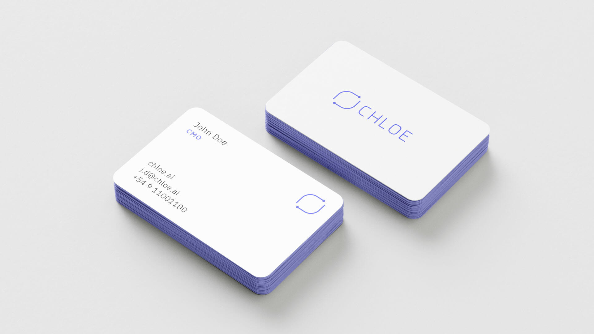
- Marketing collateral
- Brand guidelines
Challenge
Chloe aims to automate customer service for small businesses and entrepreneurs with limited technical knowledge by developing an intuitive and user-friendly platform.
Having a brand identity that conveys these values is crucial for the company’s growth and differentiation.
Solution
Symbol
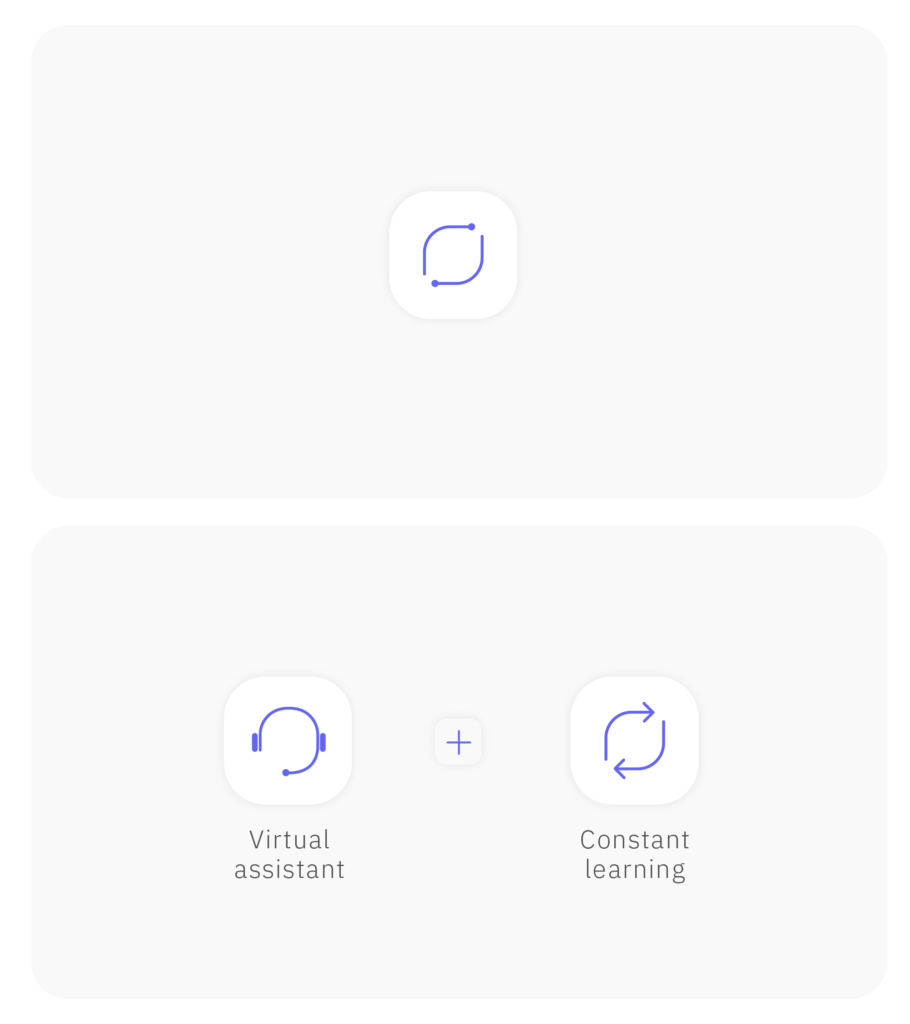
Two key concepts were identified when conceptualizing Chloe’s identity.
The first is that it is a virtual assistant designed to simplify users’ lives. The second, fundamental to the app, is the use of artificial intelligence that constantly learns about users’ needs, creating an increasingly personalized experience.
Symbols representing these concepts were combined to create a unique emblem that captures the essence of Chloe. Additionally, it is a flexible figure, adaptable to various contexts, which is essential for a growing company.
Logotype
Color palette
Typography
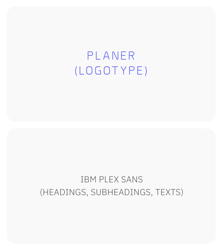
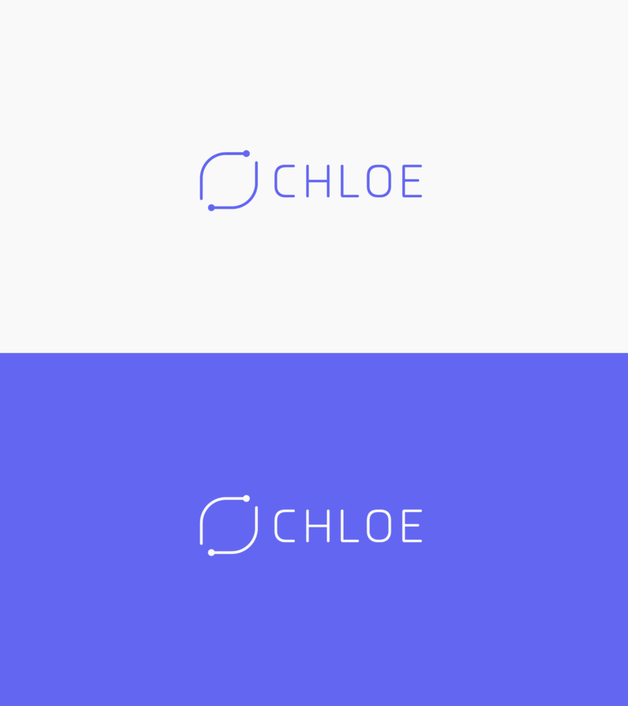
Two primary typefaces were selected.
The first accompanies the symbol and was chosen for its harmony both morphologically and conceptually, with smooth curves and rounded endings that combine with a technological, friendly, and open imprint.
The second typeface, developed by IBM, is used for headings and general text, standing out for its professionalism and warmth.
The decision to use only two fonts with few variations in weight reinforces Chloe’s simplicity and efficiency.
