DEVÖE Group Dubai

Branding / Web Design

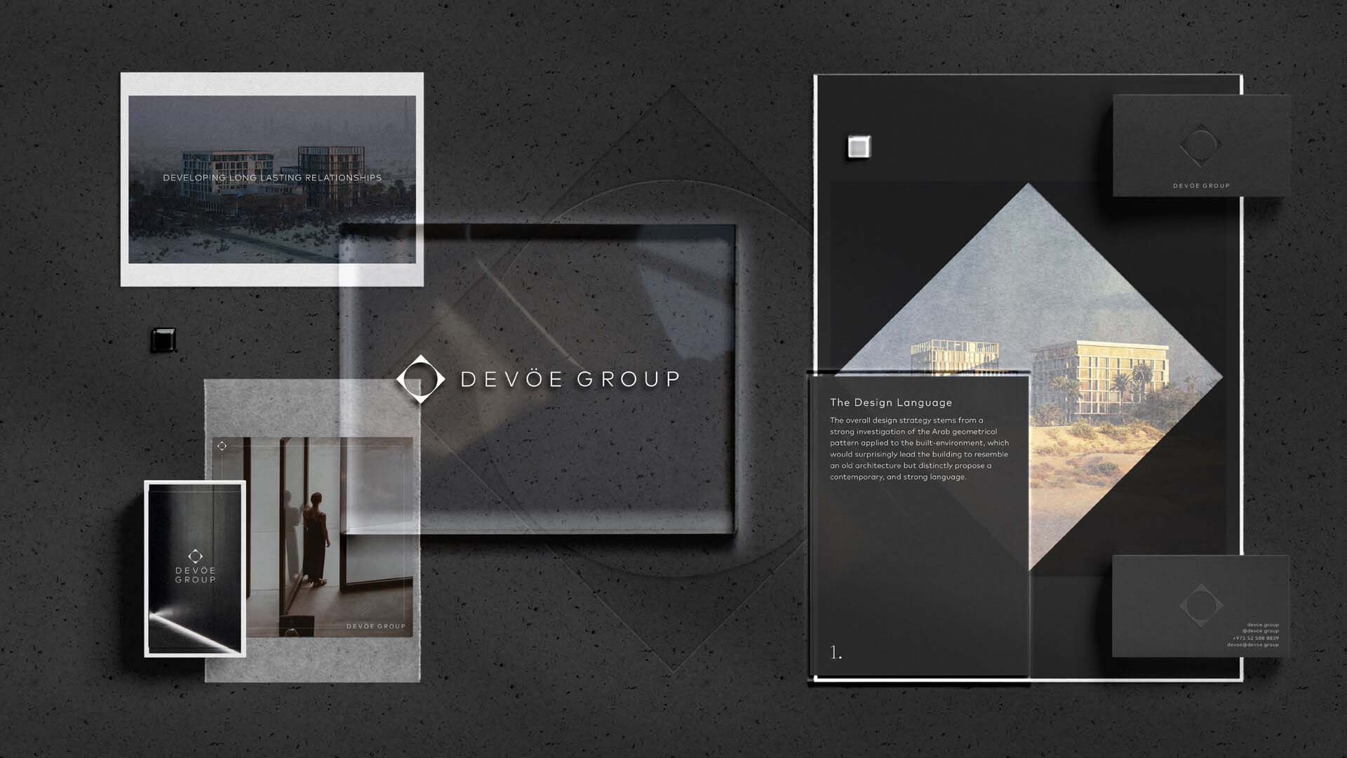
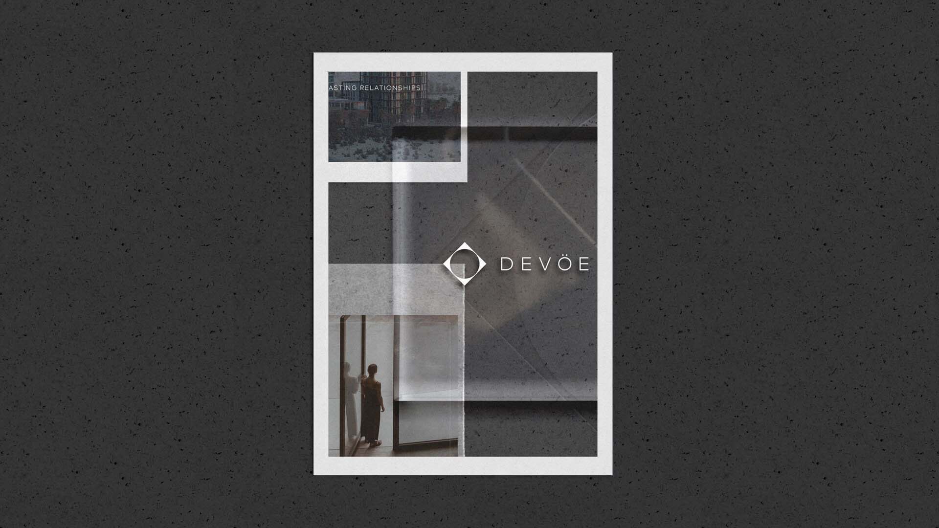
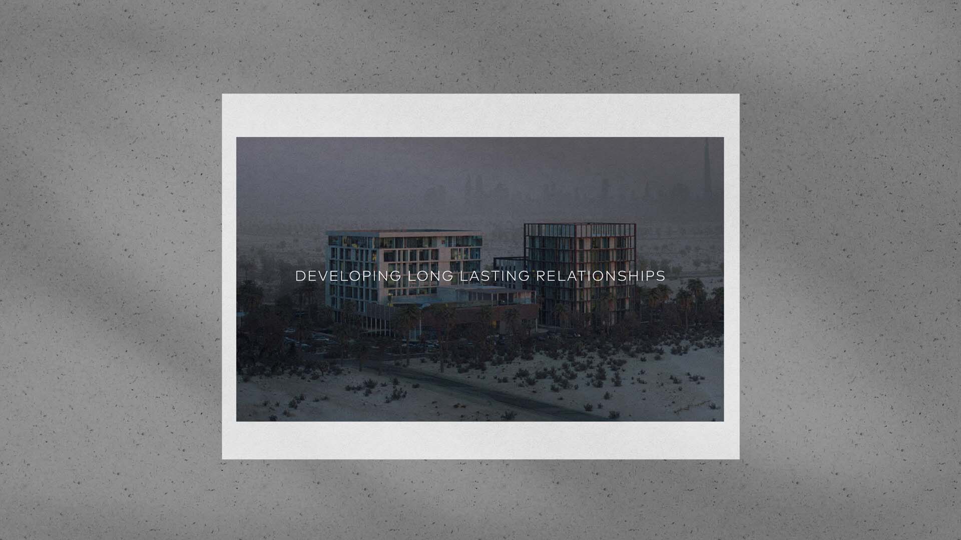
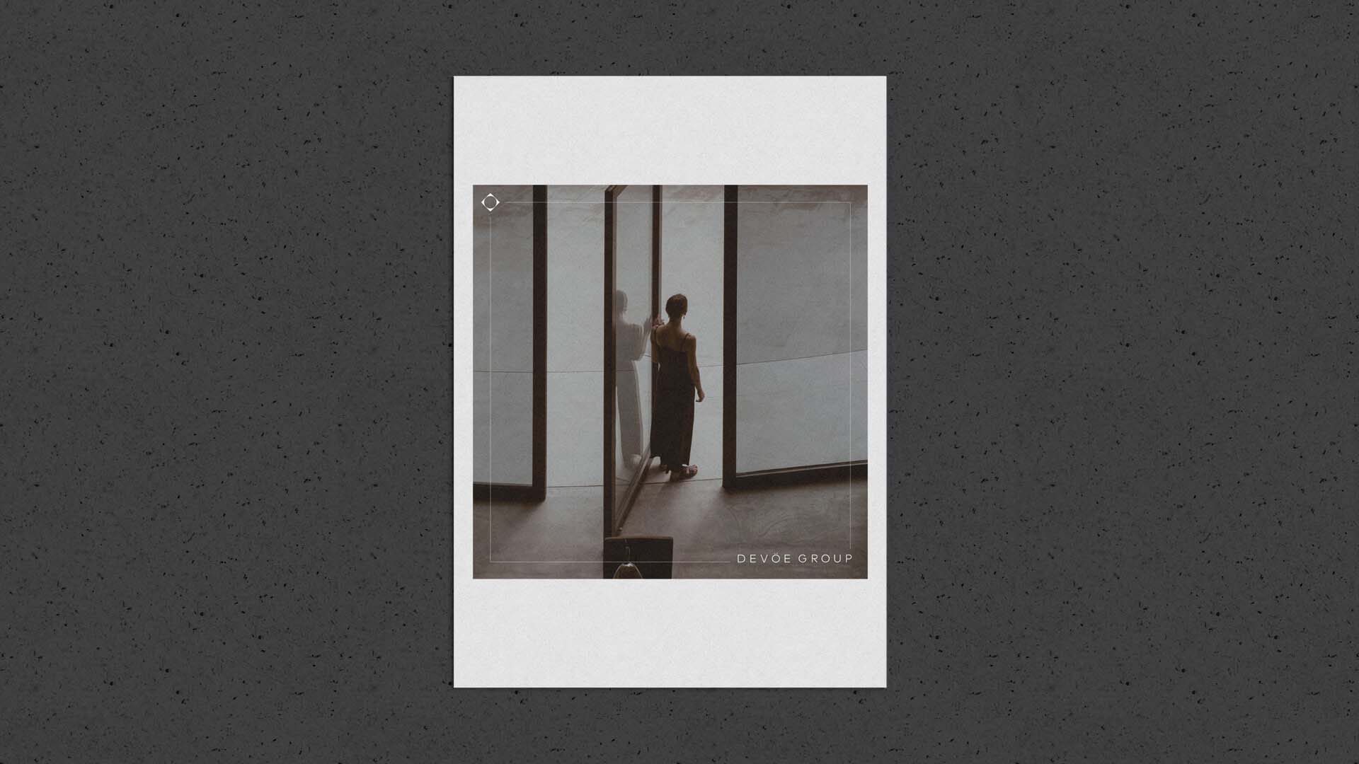
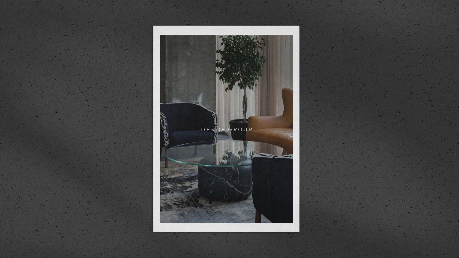
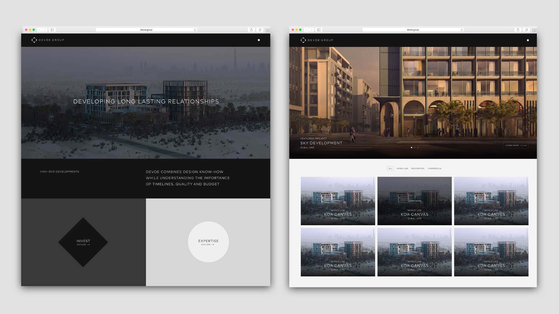
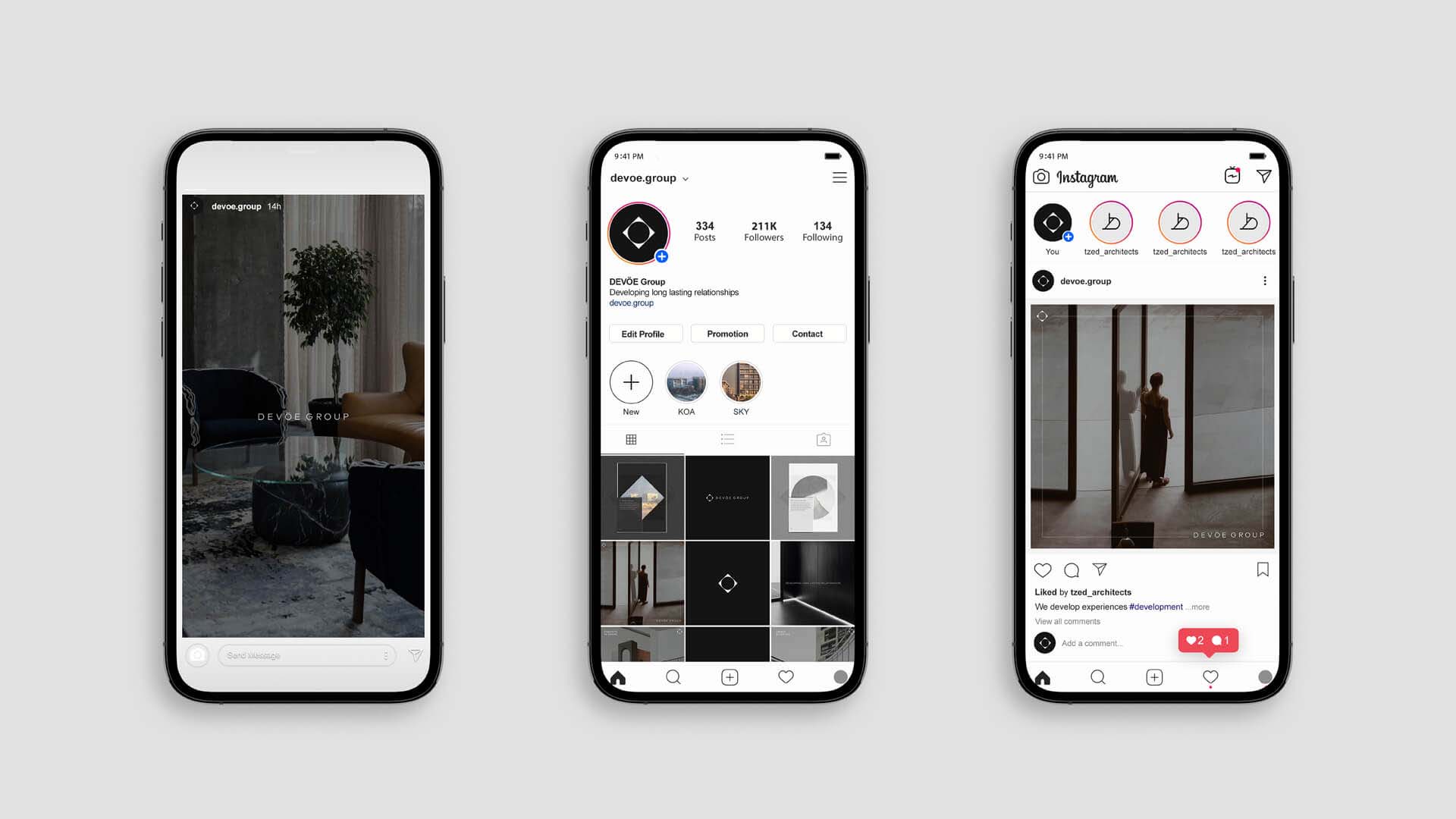
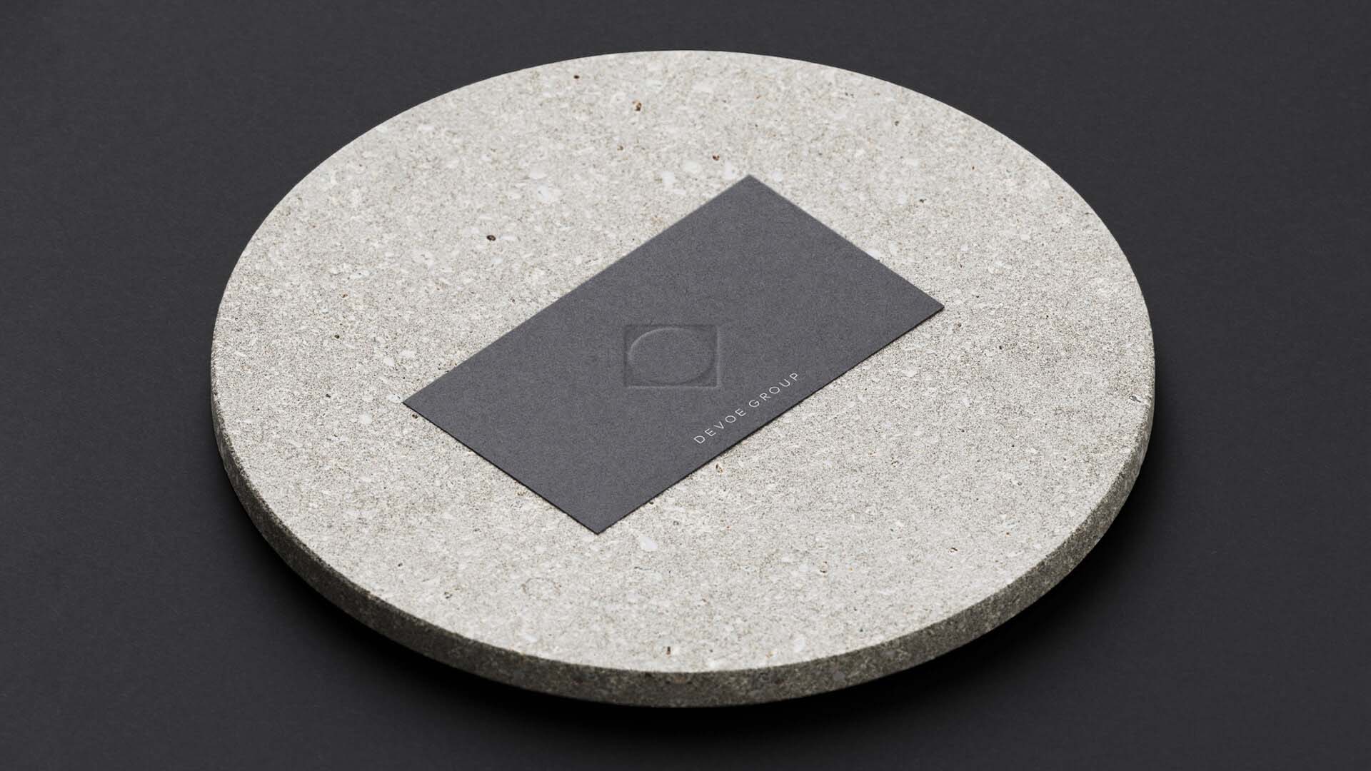
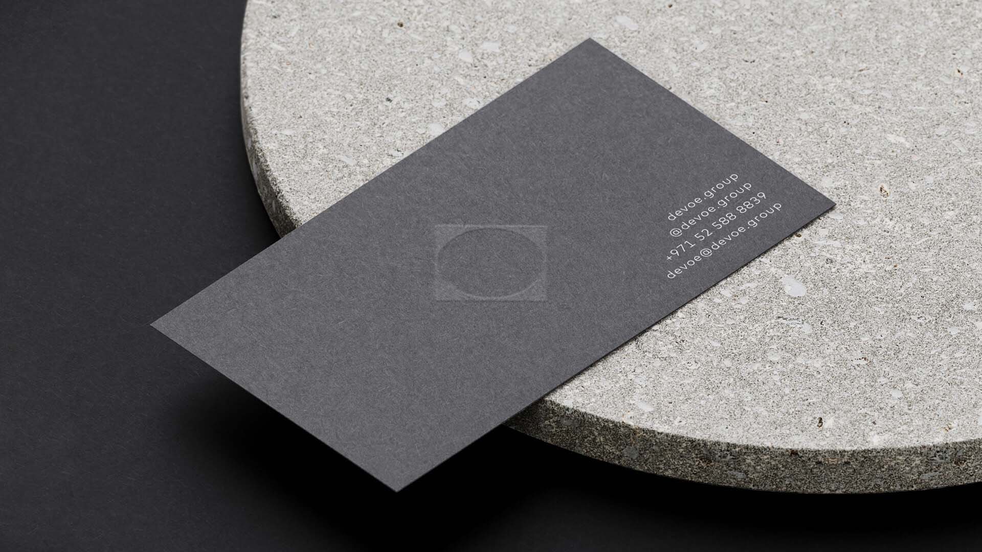
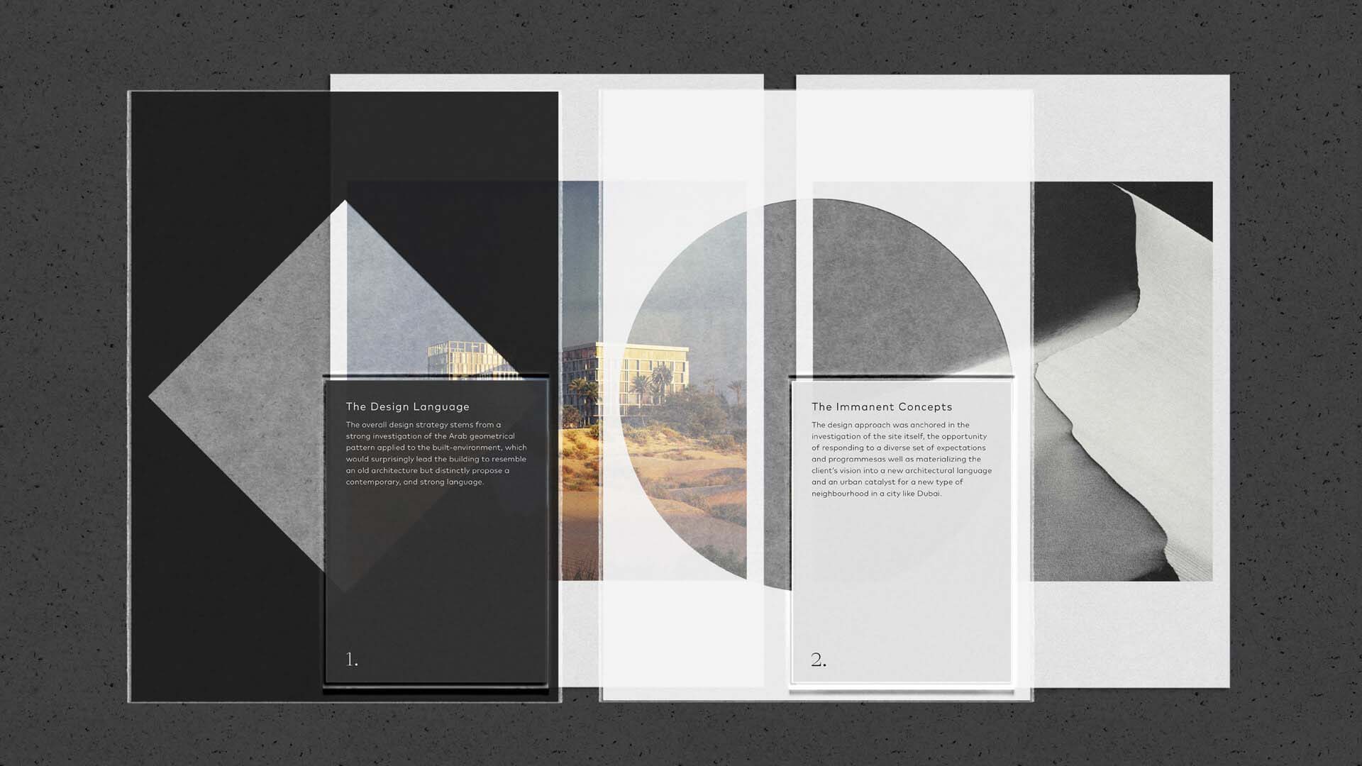
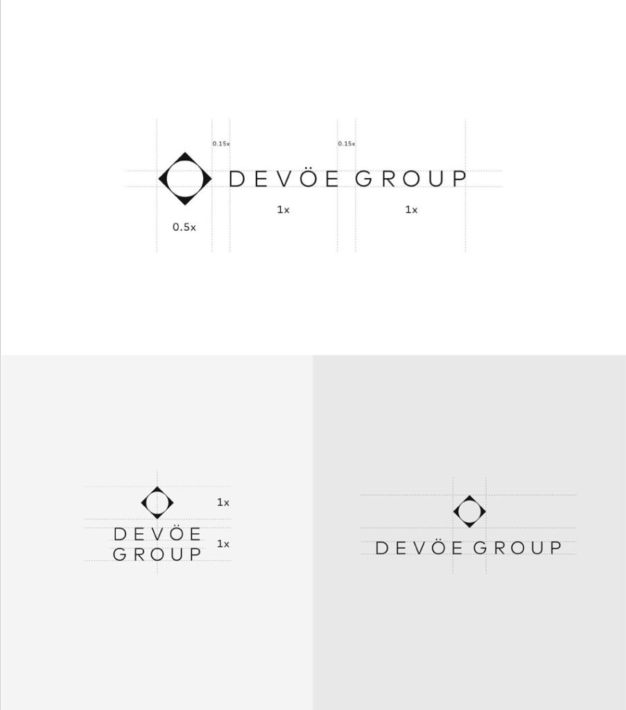
Timeless and contextually relevant. Refined yet robust. These were the foundations to shape the identity for DEVÖE Group, a boutique real estate development company in Dubai.

Tailored to the specific end users of this company, every element of this one-of-a-kind brand strategy is meticulously crafted, resulting in a bold and unique presence.

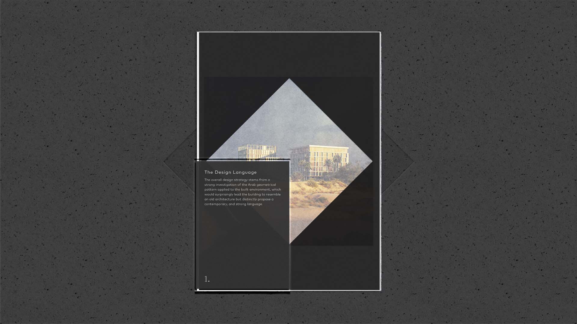
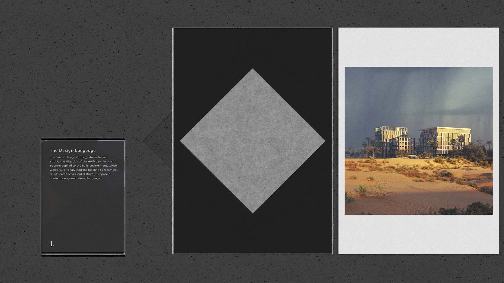
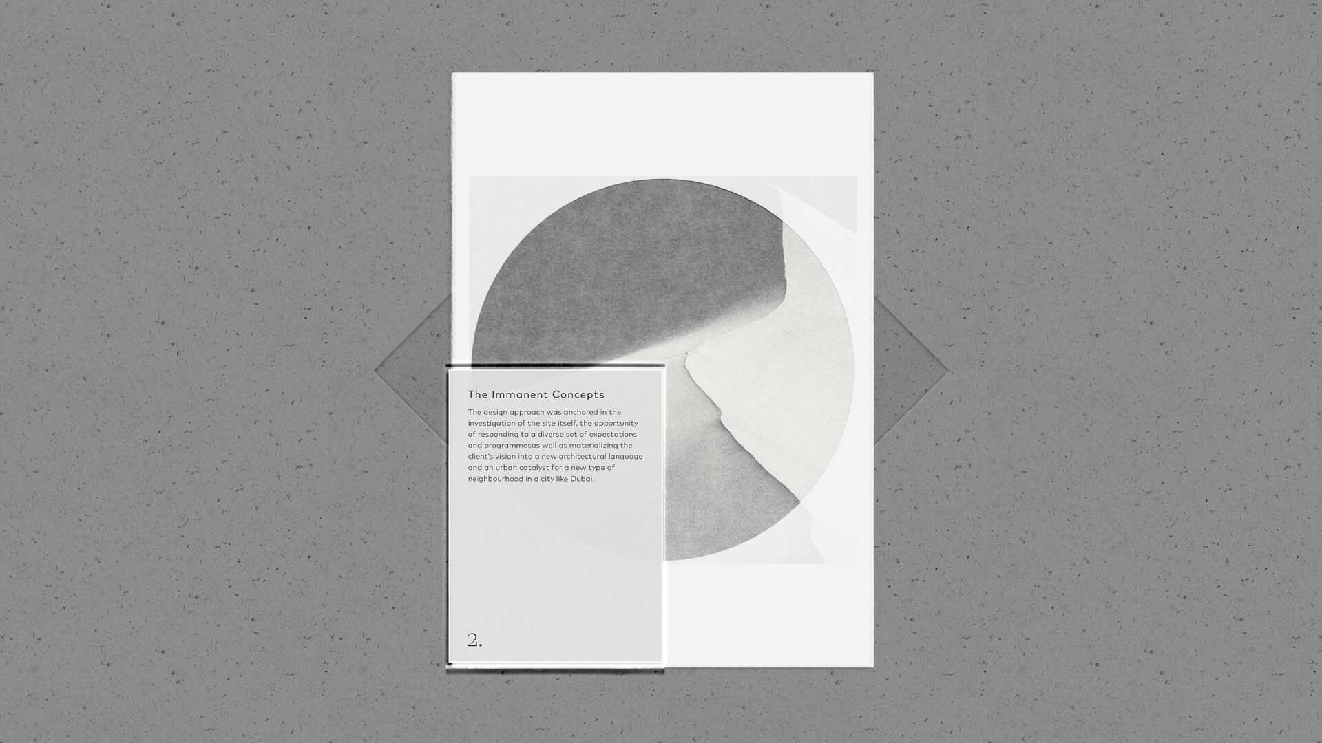
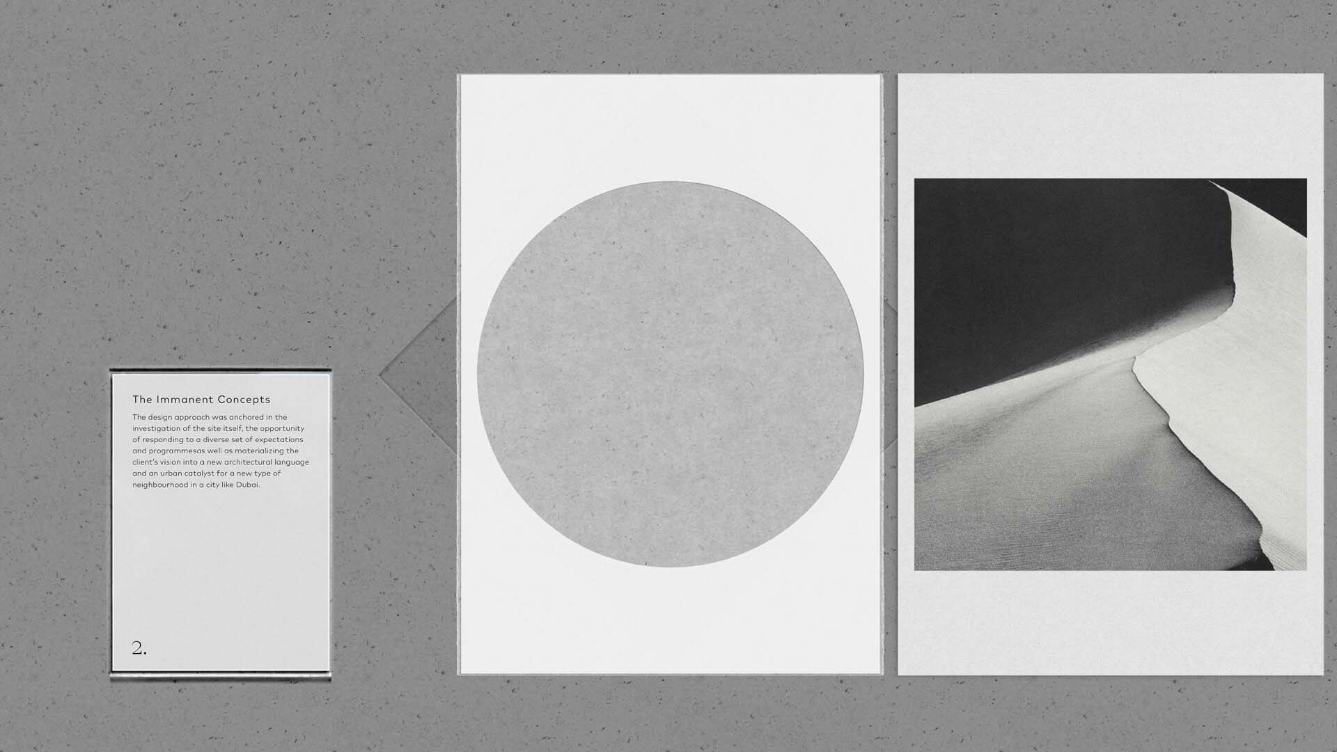
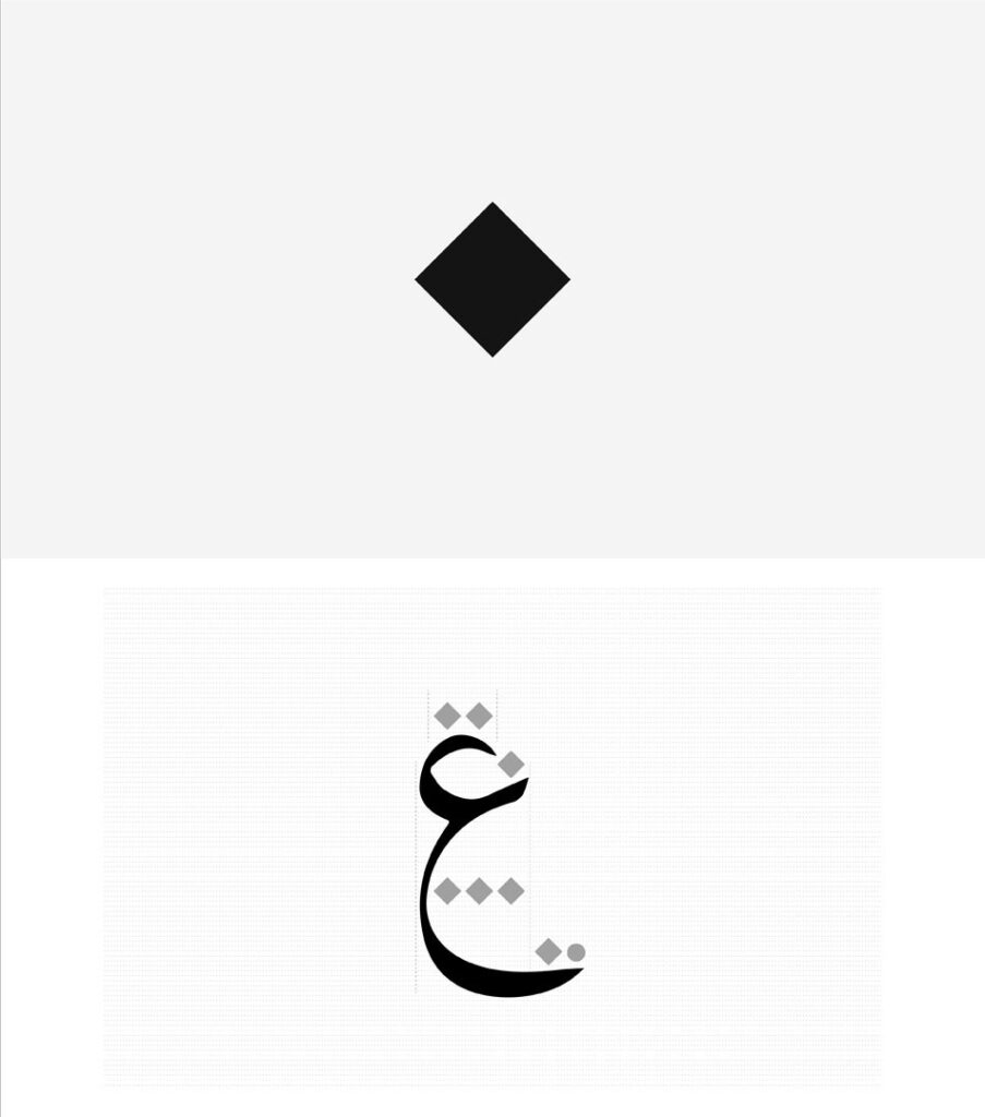
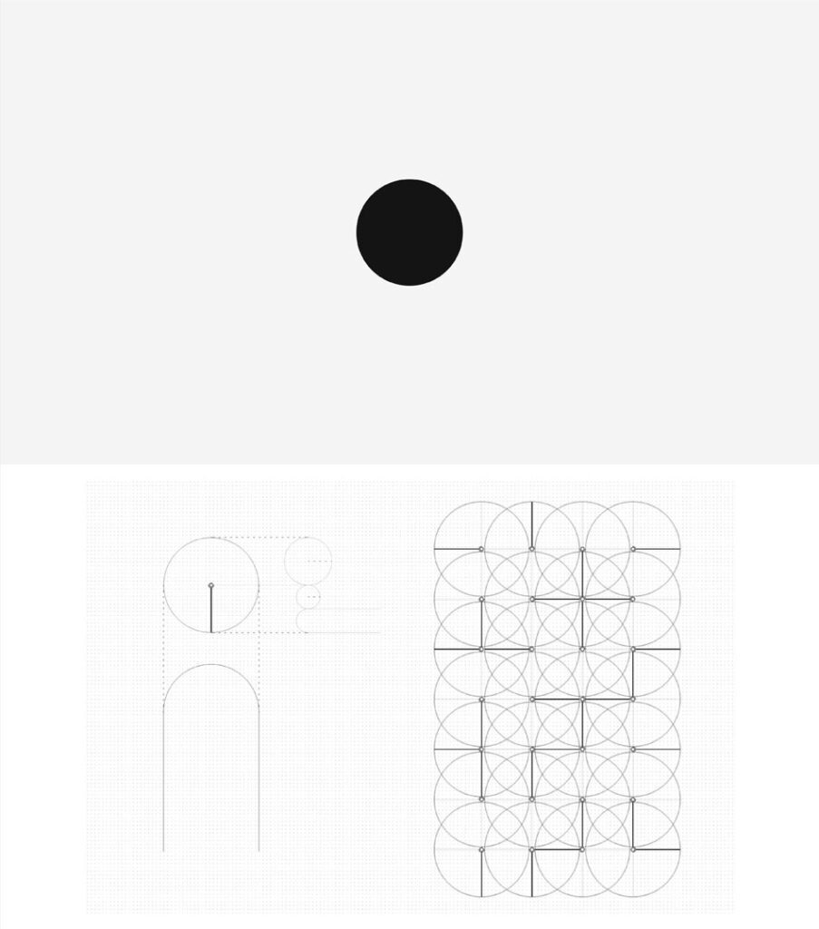
A great deal of research was conducted to identify common contextual factors within the Middle East. A respectful homage to the rich cultural heritage of the region was paid, while preserving the focus on the real estate sector.

The Diamond

A key differential value from DEVÖE is developing experiences that are functional and contextually relevant.
Following the latter, a great deal of research was conducted to identify common cultural factors within the Middle East.
A salient characteristic is the presence of geometry that is in line with the permanent and immanent nature of the universal concepts.
This also can be seen in the way written language is composed.
A simple yet powerful element, the nuqta, is used as the founding measure reference to form both letters and sentences.
DEVÖE aims to become a byword for high-end and design lead projects, and eventually will be the reference point in the design field.

The Circle

There are just a few elements in nature that have always been present for all mankind, the sun and the moon. The conceptual representation of these two elements is the circle.
This simple yet powerful shape has been used since ancient times to represent the permanent and immanent nature of the universal concepts.
Every human endeavor begins with a starting point, with an idea.
Every major breakthrough started from a seemingly unseen necessity that later became clear. This is possible due to the ability to think and break a given problem into smaller factors.
A key value of DEVÖE is to develop projects with a solid conceptual framework thoroughly crafted by a research focused approach.

The Logotype

The chosen typography and proportions of the logotype responds to the idea of geometry outlined in the previous texts.
The result is a logotype that dialogues in a harmonious way with the aforementioned shapes.